Lite Onboarding is a system responsible for managing employees and onboarding new employees. I was responsible for the UI and UX design for the whole product, designing for their employee and employer end of the platform, as well as their landing page.
Due to NDA, I'm only able to show the employee side of the platform in this case study.


UX Designer
Product manager
Business analyst
Engineers
3 months
Users were usually people of younger age, such as high school students who were seeking for a job. They would be using their mobile devices to fill in their information.
Employers would have to manually chase new hires to complete their details, creating friction and time wasted in the onboarding process.
This was particularly frustrating, as it included important financial details like superannuation linked to their pay. Since this information is legally required, boosting completion rates also helps employers stay compliant.
Improve the onboarding experience and visual design, as well as the responsiveness of the platform
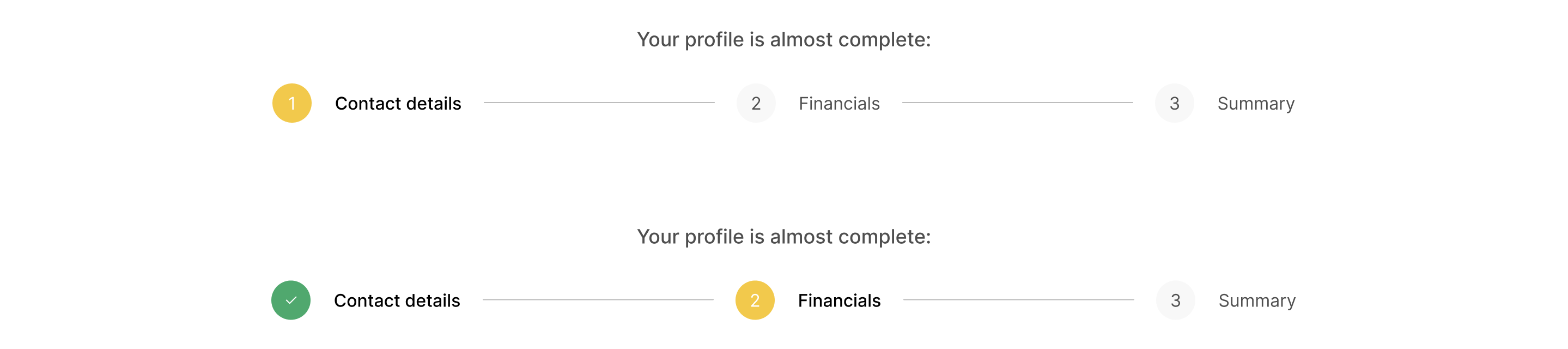
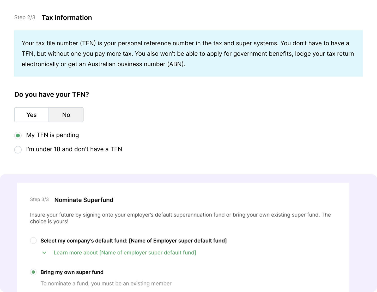
Improve clarity in the process by giving users more guidance into the process, especially in areas like tax and superannuation information
Increase form completion rates from employees. Right now the completion rates are sitting at 90%
Because I didn’t have access to customers nor users at the time of working on this project, and the team was running on a tight deadline to deliver the designs within the month, I have done a heuristics analysis of the old platform to identify key UX issues.
Here were some key problems in the old platform:
Here are some screenshots of what we had:


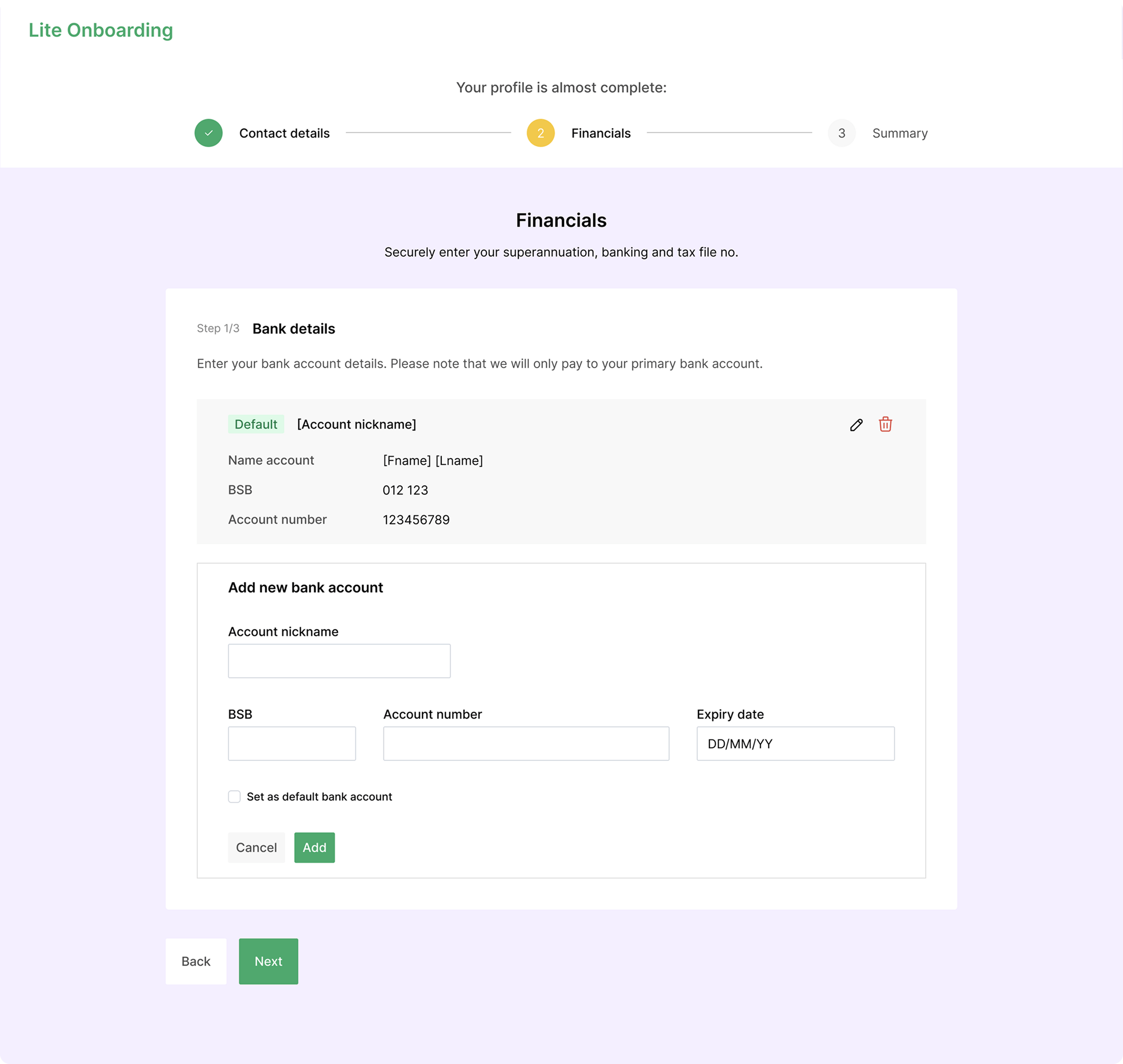
In the final designs, I have followed a design component library, while completely reworking the UI and introduced a new colour palette.
Icons and interactive states were designed with clarity and consistency in mind.
Mobile responsiveness was a key focus for the employee-facing experience, as many users primarily access it on their phones.
In collaboration with our Business Analyst, we rethought how to improve clarity across the platform. For example, by writing explanations for terms like “Tax File Number” and providing clearer guidance to help users make faster, more confident decisions.

I also designed notification emails, and employee platform that allows users to track their latest payroll and update their profile details post-onboarding. Given the younger user base, I incorporated vibrant colours and playful illustrations to make the experience feel more engaging and approachable. To meet tight timelines, I sourced illustrations from a free library to speed up delivery.


While I wasn’t able to track outcomes post-release for this project, I actively considered what success would look like. If tracking had been possible, I would have tracked these:


