Sapia.ai is a B2B software that empowers high volume companies to hire more efficiently using AI. I joined the team to redesign their candidate management platform for improved scalability, UX and visual design
Success: Reduced clicks in the main user journey by 75%

Product Designer
(Research + UX and UI)
Product manager
Product lead
Customer Success
Engineers
5 months
The old candidate management platform was a legacy platform developed entirely by engineers, with no design refresh or UX consideration for over 6 years. The interface lacked alignment with brand guidelines, and many of the components were not built with scalability or consistency in mind.
As a result, the overall experience felt outdated, cluttered, and difficult to maintain.
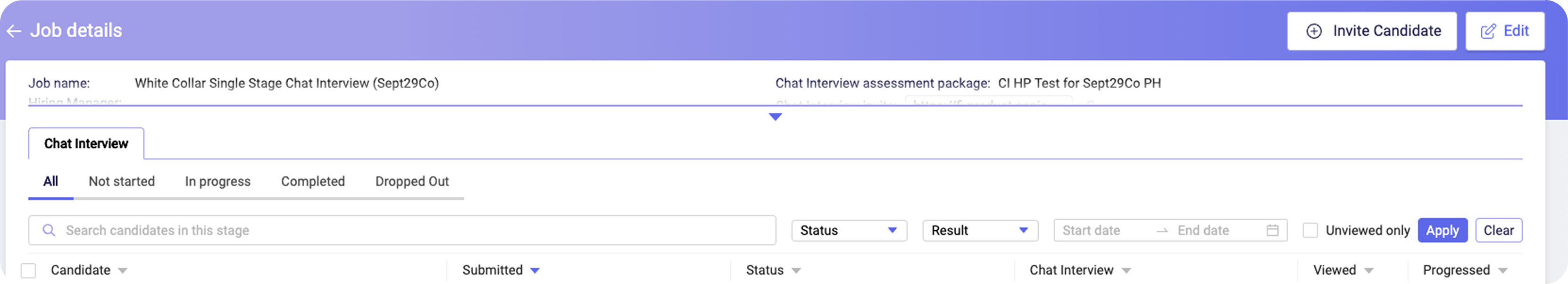
A glimpse into what the old platform looked like
I had to work around constraints with research, as analytic tools weren’t embedded in our old platform, and we could not get access to hiring managers (Our users). To work around this, here is what I have done:

Informal chat sessions with three members of the Customer Success, product lead, who regularly engage with customers. These conversations focused on:

A design audit was also done to identifying major UX issues.
Analytics tools weren’t implemented in the old platform, so I wasn’t able to gather quantitative data to support my research.

Looked at ATS platforms that hiring managers use on a daily basis, such as Workday, SuccessFactors, Ashby and Greenhouse to identify common patterns and designs.
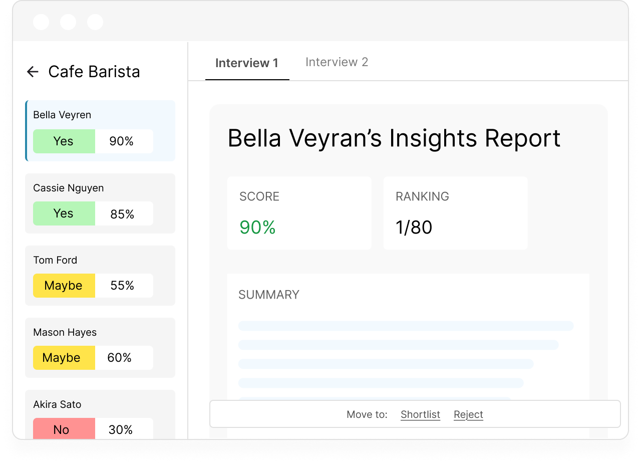
When a role opens, they will receive a candidate insight report, generated from the Sapia.ai assessment that the candidate completed during their application.
This is the current journey they go through (Click to expand):

This flow involves multiple clicks and tabs, creating unnecessary friction, especially when candidates have two assessments, doubling the effort required.
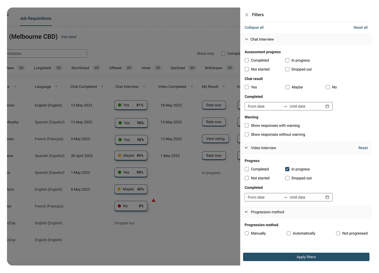
There were no clear guidelines for how components should interact. User experience was often sacrificed whenever new filters or features were added on the page.
The platform was used by both Customer Success and hiring managers, but admin features were still visible to hiring managers, causing clutter and confusion.
design a more scalable, self-serve platform that supports future growth, allowing room for future initiatives without sacrificing user experience and significant engineering effort?
Together with our product manager, we have defined key metrics that served as a foundation for my design decisions:
Making it easier to introduce new features and pages with reduced design and development time
Optimising the experience to access candidate insight reports
I started exploring on how we can improve the user experience of the Insights viewing experience, here were some iterations:

Display the insights report as an overlay panel that slides from the right
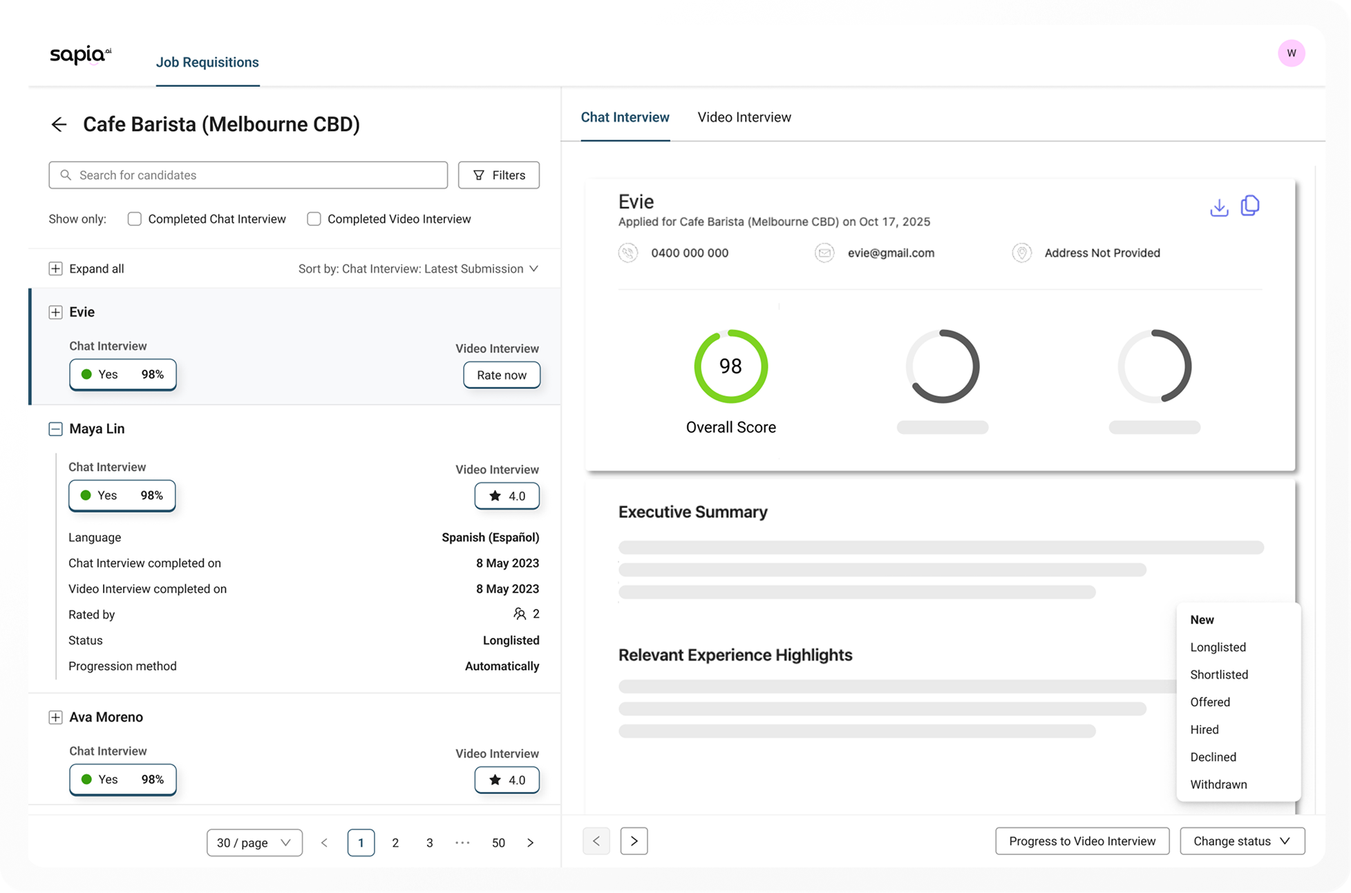
Displays insight reports on a new page with a left panel to browse candidates and take actions
Ultimately, the second option was chosen considering they might be sharing the report as link to other of their colleagues to review. The first option would make this difficult in an engineering standpoint.
We aligned with engineering to use Ant Design as the base for our new design.
To meet WCAG AA standards, I audited the components, identified accessibility gaps, and implemented fixes.

Colour contrast: 1.39:1
WCAG AA: Fail

Colour contrast: 3.36:1
WCAG AA: Pass
For example, this input border over here couldn't pass contrast of 3:1 contrast ratio on a white background. Thus have adjusted it to a deeper grey required to meet those standards
allows hiring managers to access insights reports with less clicks, managing their applicants on a single screen, and view other applicants on the sidebar without jumping back and forth
Illustrations were taken from Undraw - an open source platform, and was replaced with Sapia.ai brand colours.
.gif)
The final designs reduced clicks by up to 66%* for our customers, significantly boosting productivity their daily hiring workflow.
The redesign resulted in a more scalable platform, cutting down the development and design effort required for future feature releases.
*Evaluated based on navigating an insights report and progressing them to the next stage


Moreover, after release, we added new configuration pages and dashboards, which integrated seamlessly thanks to the consistent component patterns and page structures established during the redesign.
Post-release, analytic tools were implemented, and actively tracked to ensure customer satisfaction. New features were added with usage in mind, and minor changes were introduced based on usage statistics.


